Start the conversation
Orizont Imobiliare
The real estate market is saturated with generic promises of “home” and idealised imagery. For Orizont, we chose a different direction, centred on material honesty and architecture’s real impact on the city. We rejected visual clichés in favour of a restrained editorial presence.
Editorial and visual direction
We treated the presentation of their projects like a luxury architecture publication. Documentary photography replaces flawless renderings, offering a real perspective on the space, textures and urban context. This approach builds trust through transparency and attention to detail.
- Naming and Verbal Identity
- Photography Art Direction
- Portfolio-style presentation website
We created a visual language that communicates stability and a long-term vision. The brand no longer just sells square metres, but a philosophy of responsible living. The visual identity uses a strong contrast between black and white to underscore the rigour of their construction.
Market impact
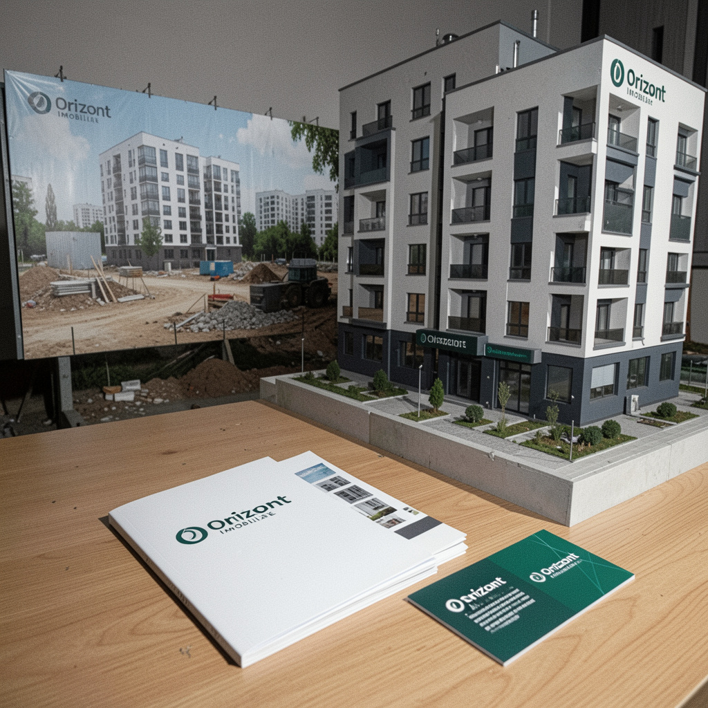
The new positioning attracted a segment of clients who value design and quality of execution over the lowest price. We developed a set of brand guidelines to control every touchpoint, from construction-site hoardings to premium presentation brochures.
Our strategy transformed Orizont from a local developer into a benchmark for best practices in urban regeneration. We showed that a real estate brand can be sophisticated without being arrogant, and clear without being simplistic. The success of the launch campaign confirmed the market’s appetite for more mature communication.
Write to us directlyWe reply from Bucharest and work anywhere